14 of the Best Property Management Website Designs, Ever

Years ago, no one cared what your property management company’s website looked like. All that mattered was how the community websites were designed and that they drew in prospective residents. Today, however, it matters, and designing the best property management website you can is integral to the growth of your business.
To show you what we mean — and provide you with some inspiration — we scoured the internet to find 14 of the best property management website designs, ever. Great website design takes work, and let’s face it, your property management company’s web presence means more now than ever. So, let’s reward great work and highlight the best property management website designs ever — in our opinion.
With the right design, property management companies can integrate resources on their websites as a tool for both their current residents and as a marketing strategy for recruiting new business. Now that’s an efficient use of space!
On that note, let’s gain a better understanding of what works and why by checking out a few of our favorites. We’re looking at functionality, design, clever use of photos, useful resident tools, and even hamburger menus.
Website simplicity
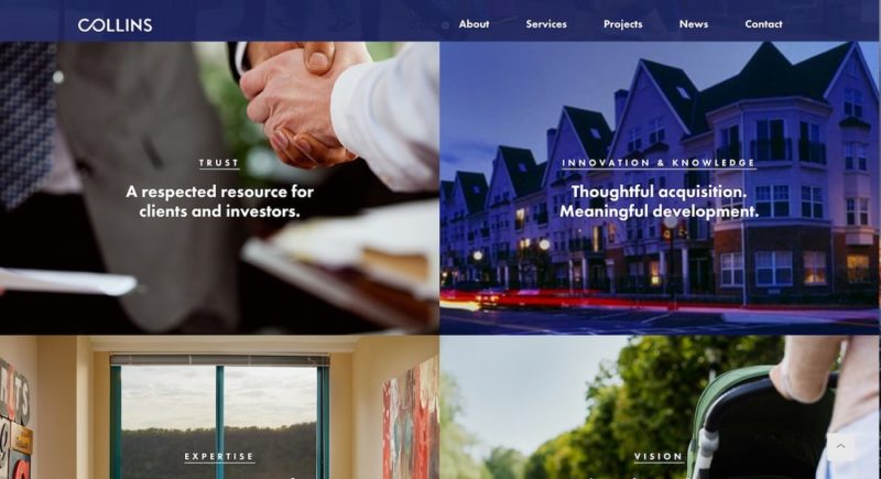
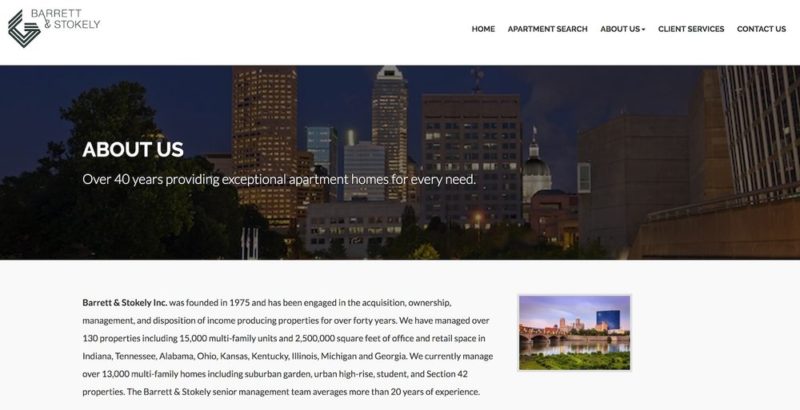
Let’s start off with something every website should hold as a core value, simplicity. A simple, clean design prevents a website from being its own worst enemy by overloading guests with content. If your website is simple, clean, and intuitive, visitors will feel compelled to explore.
Being able to provide a clean user experience to your target audience will make it worth the effort it takes to design your site. Just to be clear, extra effort doesn’t necessarily imply extra time, just a heightened awareness of what your audience is looking for and how you can deliver it to them through simple design.
Here are some examples of property management companies whose website design leverages simplicity:
Collins
Barrett and Stokely
Amazing website navigation
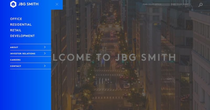
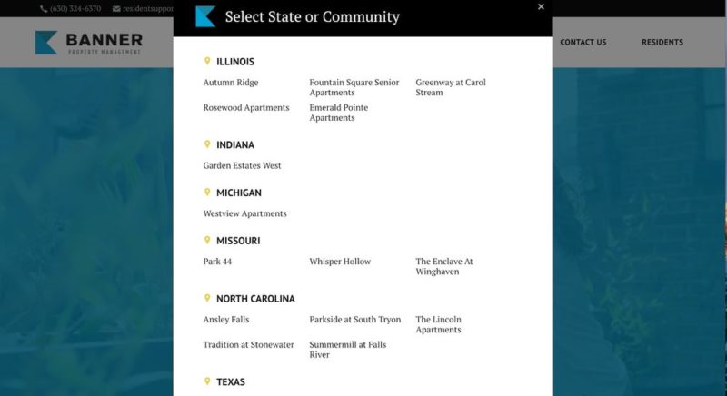
The next property management website design component we looked at was intuitive navigation. This goes further than sticking some buttons at the top of the page. Whether it’s the smart use of the hamburger button (no longer just for mobile!), or an intuitive navigation that guides users through the site, we’re loving the creative navigation tools our property management friends utilize.
JBG Smith Properties
Banner Property Management
Bloggers on the loose
We know a thing or two about running a great blog, but we’re always looking for inspiration. So when we see said inspiration, we take notice! That’s why we’re giving a shout out to the Apartmentality blog from the team at Fairfield Residential. Not only does the landing page make great use of photos and a superb layout, the content is fresh and current.
Our blog advice to any property management company team is to create a blog one step at a time. Creating exceptional content takes practice, so focus on one post, then another, then another. You get the idea. Make sure to set up your blog infrastructure before you start writing. Check out our top 9 property management blogs for more inspiration.
Fairfield Residential

Photos done right
The following property management website design is simple enough in theory, but can be a little tricky to execute. It’s the integration of photos into a web page in a seamless and interactive way. It’s a no-brainer that adding photos to property management websites is valuable. Everyone wants to show off their beautiful properties, so it’s important to strategize how they will be used. Let’s look at three ways websites use photos to engage their users.
User Interaction
These two property management companies use interactive photos/icons to direct residents to their respective communities while attracting the attention of potential developers. The straightforward and aesthetically pleasing buttons are more than just pretty to look at, they’re also functional!
Templeton Property Management
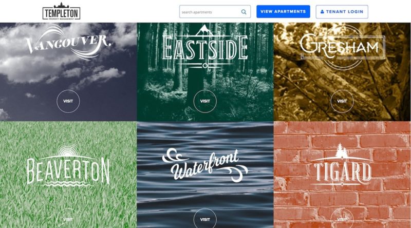
Beautiful icons on this homepage direct visitors to different properties.
Cortland Partners
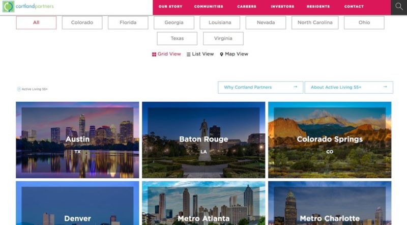
The interactivity on this page allows potential residents to explore properties in specific areas while directing current residents to their community resources.
Beautiful headers
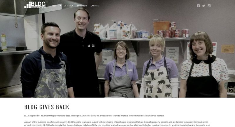
Sometimes the right photo makes all the difference. While stock photos are an effective way to market, they can often feel generic and impersonal. The reason this next header works is because it feels real. We know websites have a vibe and this one makes us want to crack open a cold one with our buds — a cold root beer!
BLDG Management
Enticing design
This next property management website design is the very first thing a user sees when they open the page. The Orwellian messaging is not meant to be subtle, but its design sure is. It makes great use of space and certainly draws the eye to the right message.
The Management Group
Cool tools
Some of the best property management designs feature resident services right on the website, like a portal for paying rent. Let’s take a look at some innovative tools that work well for current residents while impressing potential ones.
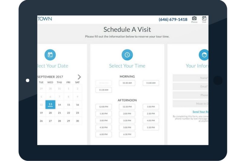
Live scheduling
This real-time scheduling tool puts the ball in the user’s court (i.e. potential resident) and allows them to engage directly with the website. No emailing necessary. Plus, you can do it from your phone!
Stuyvesant Town
Maps
For multi-state property management companies, this next feature is a must. Both visually appealing and practical, a map lets your users explore your communities and interact with your page.
Harbor Group Management
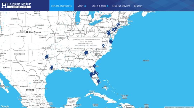
One feature we like here is the ability to enter a zip code and see communities nearby. This is a quick way to narrow the results locally or explore a new city. On the flip-side, it’s fun to scroll around the map and daydream — that can’t just be us, right?
Urban Land Interests
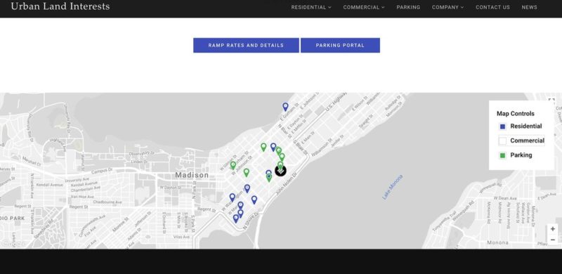
Similarly, this website allows visitors to view an interactive parking and community map.
Parallax scrolling
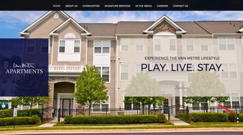
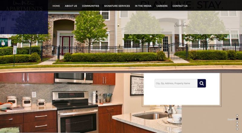
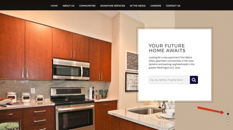
This next tool is subtle but important. The first instinct on a new page is to explore, and one of the tools of exploring is scrolling. With this website design, scrolling is locked and moves in a strategic order, instead of separating things by page. It’s a way to control the user experience and curate the message of the website. It’s ingenious! Also, it’s fun to play with.
Van Metre Apartments
Unified design
Finally, let’s look at one of our absolute favorite property management company website designs. What makes this website fun to explore? We think it’s a combination of being visually appealing and intuitively designed. Some of our favorite features include:
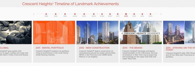
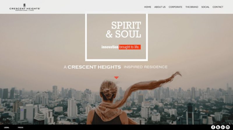
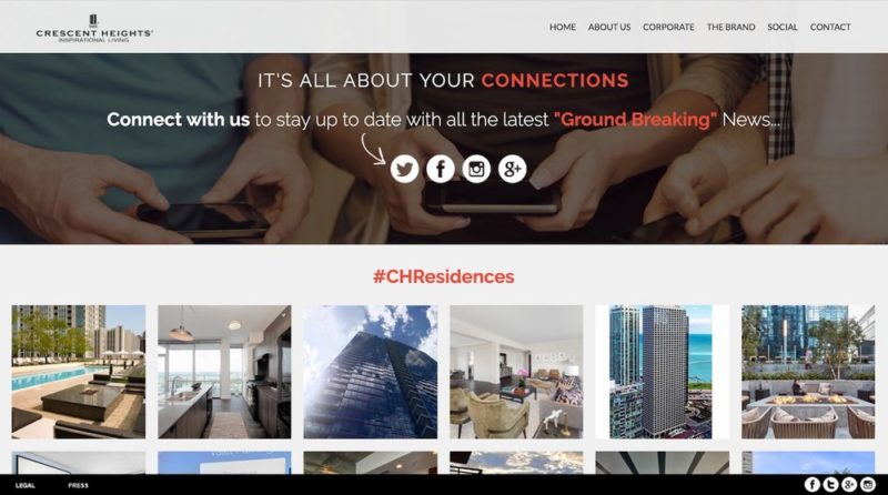
Crescent Heights
Timeline of landmark achievements
Moving head image
Inclusion of social media
So, what makes a great property management website design?
Here’s a quick recap of some of what we learned from the best property management website designs:
-
Useful navigation — hamburger menus and logical pathways
-
Blogs — drive the narrative of your business
-
Photos to their fullest potential: Headers, buttons, and your own beautiful photos
-
Cool tools: scheduling a visit, interactive maps, and parallax scrolling
-
A unified website design
A lot of property management websites employ some — or all — of these elements in one form or another. By identifying which designs will help grow your property management company, you can pick and choose what works best. We hope to have inspired some amazing property management website design! Have a thought? Share it in the comment section below.

