
Introducing Metrics Dashboard

Data is critical for keeping move-ins on track, so we’re making it easier for you to quickly draw insights into how your communities are performing — not just on their own, but also within the context of your overall portfolio of properties.
Today, we’re excited to announce the upgraded metrics dashboards in the Updater Pro | Onboarding platform, bringing together resident and onsite team data in a centralized destination for you to:
- Understand which move-in tasks residents are completing and where they are getting stuck
- View a portfolio-wide leaderboard of onsite team task review rates
- Track welcome letter engagement
- Measure ROI with efficiency metrics
- And more!
The Metrics Dashboard is now live for Corporate and Property Admin user roles. Sign in now to check it out or keep reading to learn more.
Discover opportunities for leasing teams to improve performance
Historically, property and regional managers coached leasing teams in retrospect, after measuring their performance against company and property goals. Now, managers can discover areas for improvement in their dashboard so they can support teams and see results faster than ever.
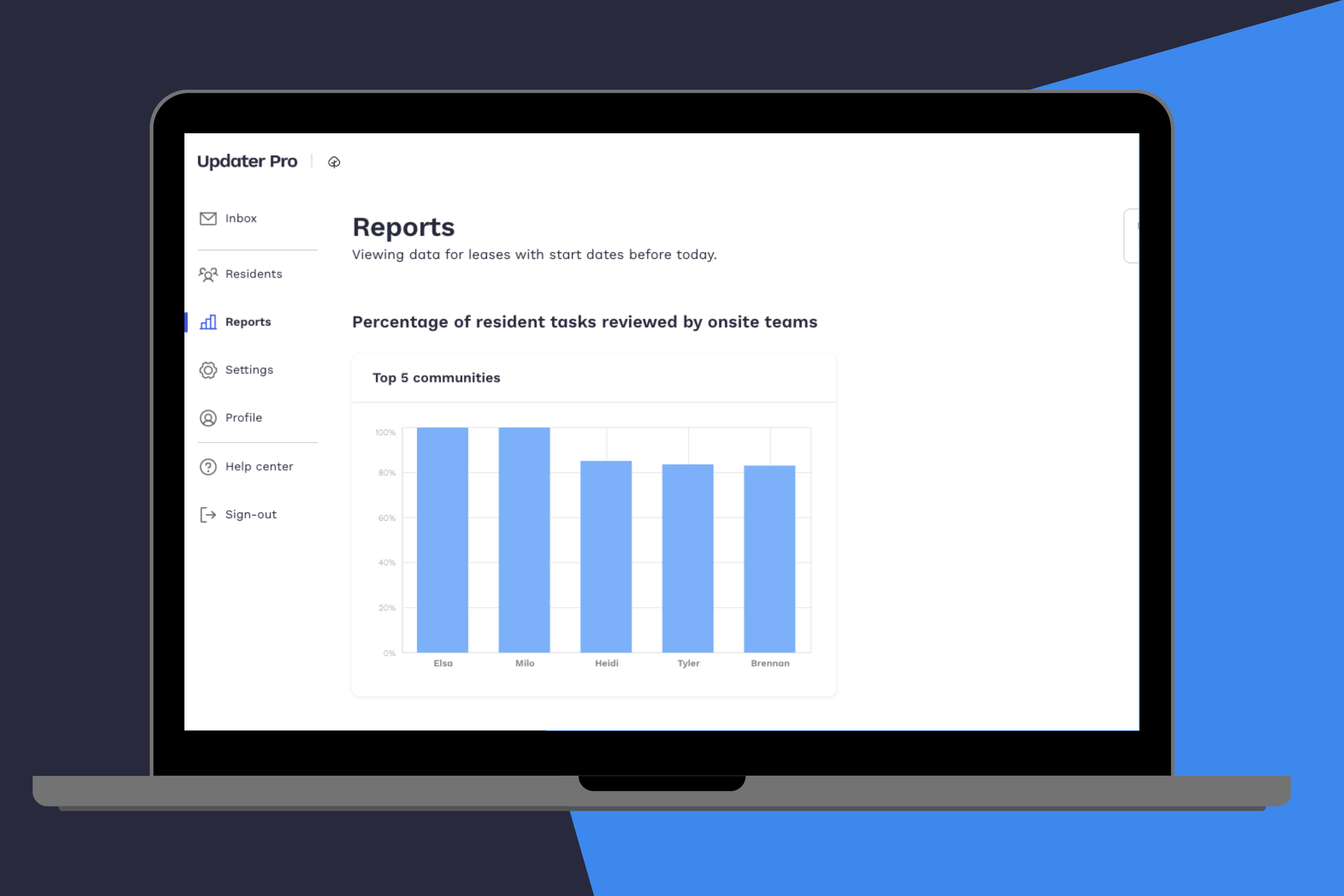
High and low performers at-a-glace
Corporate admins can view a portfolio-wide leaderboard highlighting the most engaged communities in the Updater resident onboarding process. Communities are ranked by review rate (% of resident tasks submitted that are being reviewed) and managers also have visibility into time to review (how many days it takes to review a task once a resident has submitted it). Use this data to celebrate your high performers and give extra support to less-engaged communities.
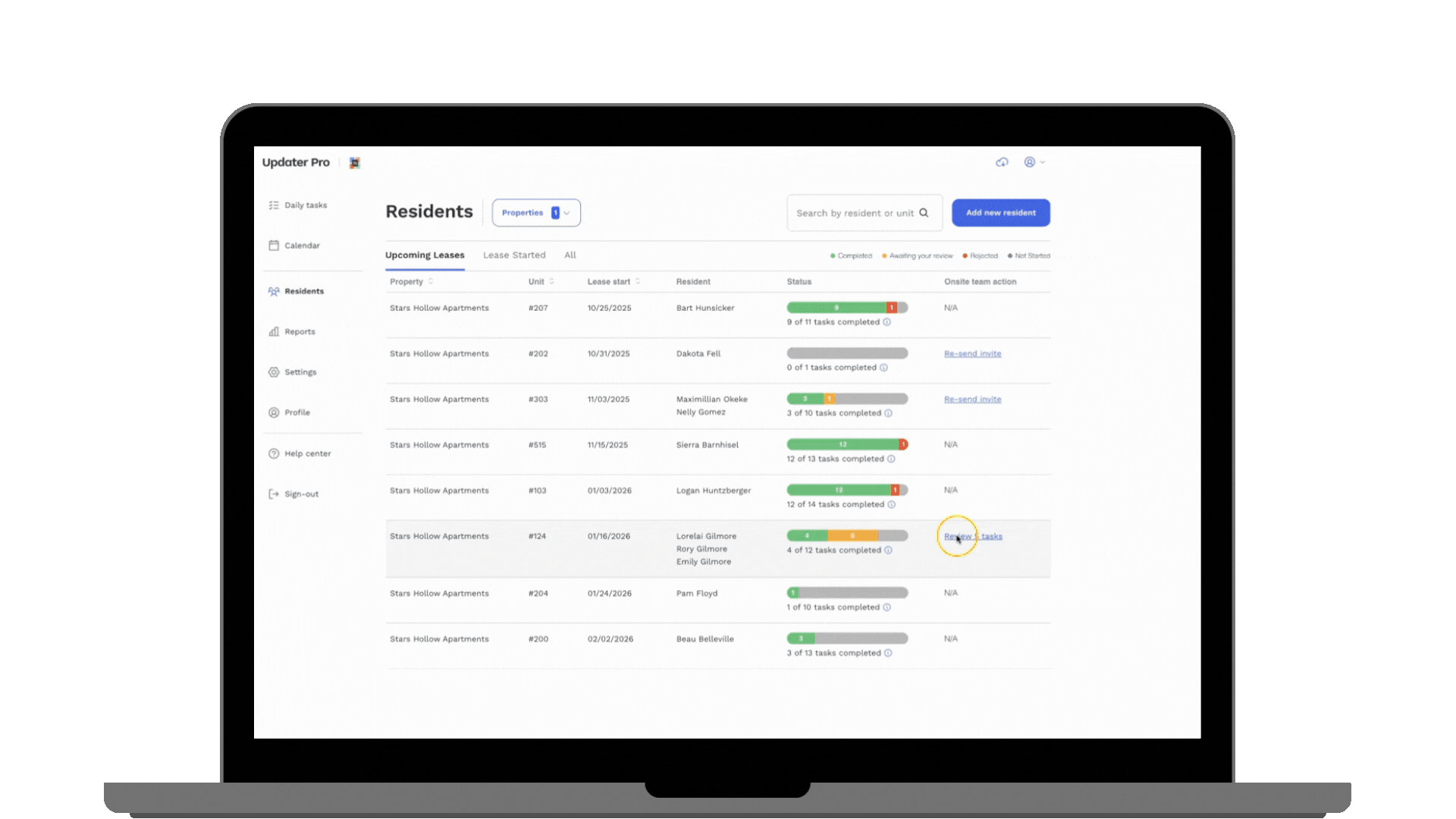
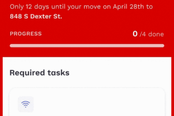
Required task completion
Now, you can easily view the percentage of tasks submitted by residents and the percentage of tasks reviewed by leasing teams for all required tasks. This will help you surface minor issues before they become major problems. For example, you may notice that task review rates have dropped indicating a leasing team is not approving or rejecting tasks that residents submit. This data can help you have a conversation with your leasing team about the importance of timely reviews to maintain a great resident onboarding experience.
Welcome letters
The new dashboard offers insights into how your residents engage with their welcome letter invite. Quickly view unit-specific data such as:
- Units invited
- Units claimed
- Unit claim rate
- Welcome letter email open rates
Efficiency improvements
In this section of the dashboard, you can see exactly how Updater is helping you save time and streamline your processes. Key metrics include:
- Hours saved compared to hours that would have been invested into resident onboarding before Updater Pro Onboarding
- Emails reduced – between manual invites, reminders, and information sharing, Updater is getting your teams out of emails and focused on more important tasks
The Metrics Dashboard is only the start of monitoring and optimizing possibilities. We are as excited as you are thinking about different data and functionality that will create even more impactful metrics in the future. As you start exploring the dashboard, we hope you’ll share feedback with us.
Get started now!
There’s no setup required, head to the new Reports tab in your Updater dashboard.
More Product News
New from Updater: Built to make the resident experience feel easier for everyone.
15 May 2026
Product updates: Sign-up flow enhancements and custom task additions
11 February 2026